Spotting Color Palettes That Drive Emotion

Quick Tip
Pay attention to dominant color hues to understand the subconscious emotional cues a director is sending.
You'll learn how to identify how color palettes manipulate viewer psychology and way filmmakers use specific hues to signal shifts in mood. Understanding color theory isn't just for art students—it's how you spot the difference between a movie that looks "nice" and one that actually hits you in the gut.
How Do Filmmakers Use Color to Signal Emotion?
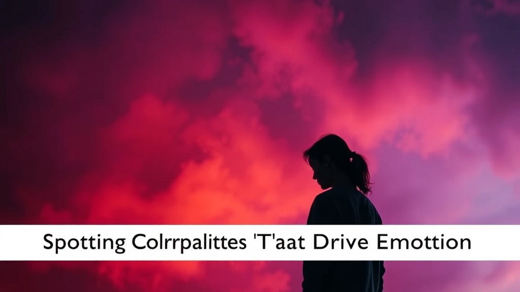
Filmmakers use color to trigger subconscious biological and psychological responses in an audience. For example, a sudden shift from warm, golden tones to cold, sterile blues often signals a loss of safety or a change in a character's mental state. It's a visual shorthand that works even if you aren't paying close attention to the dialogue.
Think about the way a cinematographer might use a highly saturated red to represent danger or passion. That's not an accident. It's a calculated move. You can see this in the way color theory is applied in high-budget productions to guide your eyes toward specific focal points.
Here is a quick breakdown of common color associations used in cinema:
- Red: Represents high-intensity emotions like rage, passion, or immediate danger.
- Blue: Often used to create a sense of isolation, melancholy, or clinical detachment.
- Yellow: Can signal warmth and happiness, but in many thrillers, it represents sickness or decay.
- Green: Frequently used for organic, natural settings or—conversely—unsettling, sickly environments.
What Is the Difference Between Complementary and Analogous Color Schemes?
Complementary schemes use colors from opposite sides of the color wheel to create high contrast, while analogous schemes use neighboring colors to create harmony and a sense of continuity. If a scene feels "tense," the director might be using complementary colors to create visual friction. If a scene feels "dreamy" or cohesive, they are likely using an analogous palette.
When you're watching a film, pay attention to the tension between these colors. A great way to see this in action is by looking at the color grading in modern sci-fi. Often, the contrast between a bright orange sunset and a deep blue sky creates a visual "pop" that feels satisfying to the eye. This relates heavily to the architecture of tension in suspenseful cinema, where color can heighten the sense of dread.
| Scheme Type | Visual Effect | Common Use Case |
|---|---|---|
| Complementary | High Contrast/Conflict | Action sequences or high-stakes drama |
| Analogous | Smooth/Harmonious | Dream sequences or peaceful transitions |
| Monochromatic | Focus/Singular Mood | Establishing a specific, intense atmosphere |
The next time you're watching a film, don't just look at the actors. Look at the light and the hues surrounding them. It's the difference between just watching a story and actually feeling it.