Read Between the Frames with Color Theory

A character walks into a dimly lit bar, wearing a bright red jacket. The room is filled with heavy shadows and cool, blue-toned lighting. Without a single word of dialogue, you already know the vibe: this person is the outsider, the disruptor, or perhaps the person about to cause trouble. This isn't an accident. It's a calculated use of color theory to manipulate your subconscious emotions before the script even gets moving.
Color theory in cinema is the art of using specific hues to signal mood, character development, and narrative shifts to the audience. It's more than just picking pretty colors; it's about how light and pigment interact to tell a story through the eyes. We're going to look at how filmmakers use color palettes to direct your attention and bake meaning into every frame.
How Do Filmmakers Use Color to Tell a Story?
Filmmakers use color to establish emotional tone and create visual shorthand for character arcs. Instead of explaining that a character is feeling isolated, a director might bathe the scene in desaturated, sickly greens to make the viewer feel that discomfort physically. It's a way of communicating through the retina rather than the ears.
Think about the way a cinematographer might use a "warm" palette—golds, oranges, and soft yellows—to evoke nostalgia or safety. Now, flip that. Use a harsh, sterile white or a deep, bruising violet to signal dread. This is the difference between a movie that feels like a hug and a movie that feels like a cold sweat.
A great example is the work of Wes Anderson. His films don't just have "colors"; they have strict, uncompromising color palettes that define the entire world of the film. If you watch The Grand Budapest Hotel, the pinks and purples aren't just aesthetic choices—they are the very DNA of the setting. It creates a sense of a storybook reality that is distinct from our actual world.
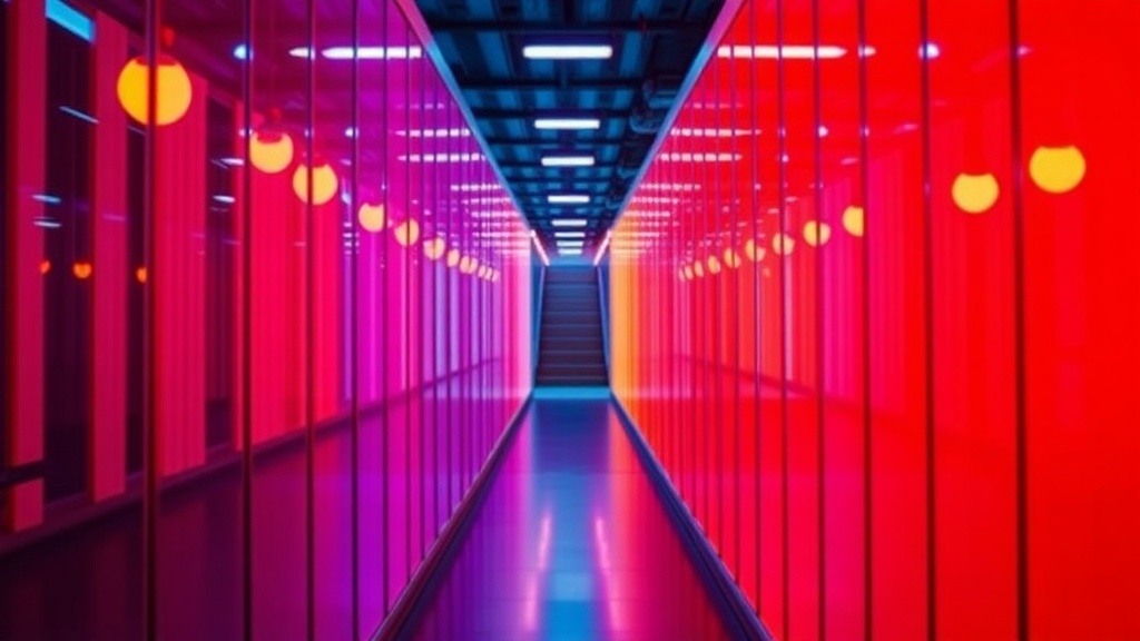
On the other side of the spectrum, you have the gritty, high-contrast look of neo-noirs. You'll see deep shadows paired with neon blues and magentas. This creates a sense of artificiality and danger. It tells you that the world is high-tech but low-life. It's a visual language that you've likely seen a thousand times in modern sci-fi, but understanding the "why" makes the viewing experience much richer.
If you want to see how color works in tandem with physical space, check out our deep dive into deconstructing aspect ratios in cinema. The way a frame is shaped is just as vital as the colors inside it.
The Three Main Color Schemes
Most professional colorists and cinematographers rely on three primary relationships to build a scene's look:
- Complementary: Using colors from opposite sides of the color wheel (like teal and orange). This creates high contrast and makes certain elements pop.
- Analogous: Using colors that sit next to each other (like red, orange, and yellow). This creates a sense of harmony and calm.
- Triadic: Using three colors spaced evenly around the wheel. This is often used for a more vibrant, almost surreal feeling.
What Are Complementary Colors in Film?
Complementary colors are pairs of colors that sit opposite each other on the color wheel and provide maximum contrast. This technique is incredibly popular in modern Hollywood because it creates a striking visual "pop" that the human eye is naturally drawn to.
The most famous iteration is the "Teal and Orange" look. You see it in almost every blockbuster, from Transformers to Mad Max: Fury Road. The logic is simple: human skin tones are naturally warm (oranges/reds), and by making the shadows or the background cool (teals/blues), the actors stand out from the environment. It's a way to ensure the audience never loses sight of the human element amidst massive, chaotic action sequences.
However, leaning too hard on this can make a film feel "processed." When every movie uses the same high-contrast teal and orange, the visual language starts to feel predictable. A truly great cinematographer knows when to break the rule to create a sense of uneffortless beauty or jarring discomfort. (Sometimes, the lack of contrast is actually more unsettling than the presence of it.)
When you're watching a film, look for these shifts. If a character is moving from a state of happiness to a state of depression, watch how the color temperature shifts. Does the warmth drain out of the room? Does the world become more monochromatic? That's the director talking to you.
| Color Palette | Emotional Association | Common Use Case |
|---|---|---|
| Red/Warm | Passion, Danger, Anger | Romance or High-Stakes Tension |
| Blue/Cool | Isolation, Sadness, Calm | Sci-Fi or Melancholic Scenes |
| Green/Yellow | Sickness, Decay, Uncanny | Horror or Psychological Thrillers |
| Gold/Amber | Nostalgia, Warmth, Divinity | Period Pieces or Memory Sequences |
How Does Color Affect Audience Perception?
Color affects perception by tapping into biological and cultural associations that we all share. While a red light might mean "stop" in one culture, in another, it might signify prosperity or luck. Filmmakers exploit these deep-seated associations to manipulate how we feel about a scene without saying a word.
Consider the use of color in psychological horror. A filmmaker might use a very specific, slightly "off" shade of yellow—not a bright, sunny yellow, but a jaundiced, sickly ochre. This triggers a sense of unease in the viewer. It feels wrong. It feels like something is decaying. You can find more on the technical side of color science via Wikipedia's entry on color theory if you want to get into the math of it.
It's not just about the colors themselves, but the saturation levels. High saturation (bright, vivid colors) often signals a sense of hyper-reality or even a dream state. Low saturation (washed-out, muted tones) often signals reality, grit, or even death. If a movie starts in a vibrant, saturated world and slowly loses its color as the protagonist loses hope, that's a masterclass in visual storytelling.
Don't forget the role of lighting. Color isn't just about the paint on the walls; it's about the light hitting them. A scene can be "blue" because of the actual objects in the room, or it can be "blue" because of the light source. This is where the cinematographer's skill really shines. They aren't just choosing colors; they are sculpting with light.
If you find yourself getting too caught up in the technicalities and losing the emotional thread, you might be overthinking it. It's easy to fall into the trap of analyzing every single frame, but remember that color is a tool, not the entire job. If you're struggling to stay immersed, read our guide on why you shouldn't rely solely on the soundtrack to understand how other senses work in cinema.
The next time you sit down for a movie, try a little experiment. Pick a color and see how often it appears. Notice how it changes when a new character enters the room or when a major plot point occurs. You'll start to see that the screen isn't just a window into a story—it's a canvas being painted in real-time to guide your heart and your head.
Steps
- 1
Identify the Dominant Hue
- 2
Look for Color Contrasts
- 3
Connect Color to Character Arcs